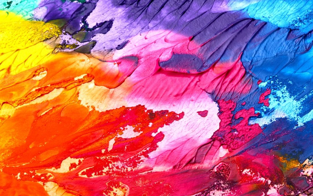
Color is one of the most powerful elements in graphic design. The use of a specific color has the potential of subtly influencing perceptions and emotions of people viewing your ads or marketing pieces. For example, using green might evoke a connection with nature, and therefore be appropriate as the primary color for an environmental engineering company’s logo. Some colors are connected with more than one sense or emotion, sometimes on opposite ends of the spectrum. Red, for example, could be connected with passion or warmth or, in a completely different application, danger or aggression. If you’re dealing with marketing or advertising that is used globally and/or with different cultural audiences, you have to be aware that certain colors can evoke different emotions depending on location or audience segment. For example, yellow, which is known to be the most eye-catching color (think traffic signs), is generally associated with happy or cheerful things, but in China it can connote vulgar emotions. If all this is starting to sound complicated and intriguing at the same time, join the club. This is one reason why using an experienced graphic designer is a real asset to your marketing efforts.
Cool vs. warm
In the simplest form of analysis, all colors could be categorized into two types, cool or warm. Examples of cool colors are blues, greens and purples, where colors like reds, oranges and yellows are considered warm. Cool colors can be associated with feelings like sincerity, professionalism, honesty and trustworthiness. Warm colors can be powerful and authoritative. You get the idea. It’s all about the possible effect a certain color might have on the brain and translating that to specific design applications.
Color palettes
It’s best to choose a group of compatible colors for your brand and stick with them. That group of colors (your color palette), along with specified typefaces (fonts) and other defined elements, become part of your corporate brand standards. Those standards should be clearly communicated to anyone inside or outside of your organization that creates materials with your company identity. An experienced graphic designer is skilled in selecting a group of colors that work together and communicate the appropriate emotions that can help build a lasting brand identity.
Those crazy car companies
Forgive me for this digression, but I have to say that one of my favorite ‘cocktail party’ discussions over the years has been the creative ways car companies have named the color choices on their different models. Take white for example. A quick check of some websites today has yielded the following different ‘white’ options for car colors: Glacier White Metallic, Ibis White, Alpine White, Mineral White Metallic, Oxford White, Polar White, Summit White, White Frost, Snowflake White Pearl Mica, Diamond White, Cashmere White Magno, and, my personal favorite, Bianco Birdcage (that last one is from Maserati…’bianco’ is white in Italian).
Bottom line – pay attention to the colors you use
The key takeaway here is that you should pay close attention to the color choices you make when it comes to marketing. You have a real opportunity to support the brand vision you have for your company by choosing colors wisely and being consistent in their application.
If you’re interested in getting an expert opinion about the colors you’re using, please contact us.